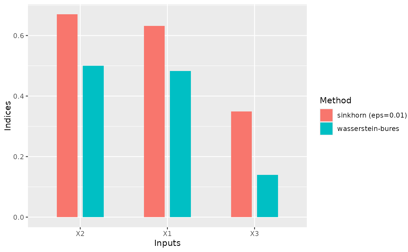
This function takes a list of gsaot_indices objects
and generates a bar plot comparing the sensitivity indices across different methods.
Value
A ggplot object representing the bar plot of sensitivity indices
grouped by input and colored by method.
Examples
N <- 1000

mx <- c(1, 1, 1)
Sigmax <- matrix(data = c(1, 0.5, 0.5, 0.5, 1, 0.5, 0.5, 0.5, 1), nrow = 3)

x1 <- rnorm(N)
x2 <- rnorm(N)
x3 <- rnorm(N)

x <- cbind(x1, x2, x3)
x <- mx + x %*% chol(Sigmax)

A <- matrix(data = c(4, -2, 1, 2, 5, -1), nrow = 2, byrow = TRUE)
y <- t(A %*% t(x))

x <- data.frame(x)

M <- 25

# Calculate sensitivity indices
ind_wb <- ot_indices_wb(x, y, M)
ind_sink <- ot_indices(x, y, M)

plot_comparison(list(ind_wb, ind_sink))